Thursday 4 December 2014

Final Evaluation

I am exceptionally pleased with the skills I have learnt on this project. I feel that I have learnt a lot more technical skills, and honed some technical skills from last year that I wasn’t very confident with. I have also gained a lot more experience about working in the industry, in terms of discussing designs and executing someone else’s design and doing a good job purely based on your own skills and not what you think looks pretty in your own head.
I have learned so much about Weimar Berlin, which I am now embarrassed to say I didn’t even know existed. All the history I knew about Germany centred so much around WWII and Hitler, I never really thought about what Germany was like before that. I’m amazed at how open it was and how, much it relates to present day in terms of their openness of sexuality, expressing who they were as well as certain negative points such as the state of economic crisis and what people will do when money is a problem. I really enjoyed researching into Weimar culture and it is something I would like continue researching and referencing in projects to come, including non-university related ones.
When it came to creating my historical character, I found it quite tricky at times as it needed to look completely historical so I found it quite hard to come up with a look that didn’t look boring and the same as everyone else’s. When it came to the actual research and creation however, I found that working through the 11 Stanislavski posts really helped with working out what my perception of Fraülein Kost was. I enjoyed working through keywords and translating these into my design, although looking back now, I feel I could have looked a little more into this. I have definitely taken it on board as a learning curve however, so next term I will work harder on this aspect of designing.
I am exceptionally pleased with how my Contemporary design turned out. I had initially come up with a different idea, but when my model cancelled on my last minute, I was forced to come up with a new design. I am so glad this happened. I came up with my new design the night before I had to present it, and got a true taste of how faced things move in the industry. I went in a completely different direction, not only to my first design, but also to how I normally go. I truly stepped out of my comfort zone and I am so happy with the results. I feel like I utilised a lot of the skills we learnt in Lottie’s lesson and it forced me to thing creatively and look at all sorts of references and inspiration that I wouldn’t look at. Next time, I would like to get a little more experimental with the hair however. I am happy with it for the purpose of this look, as I wanted the makeup to be the main focus, but next term I would like to get more creative with my hair styling.
All in all, I am happy with my progression this term. It may have been a little delayed, but I definitely feel a lot more confident as a makeup artist and designer!


Tuesday 2 December 2014

Contemporary Sally Bowles Photoshoot

Here are some of the images from my photo shoot for my contemporary version of Sally Bowles. All in all I'm really pleased with how the look turned out.
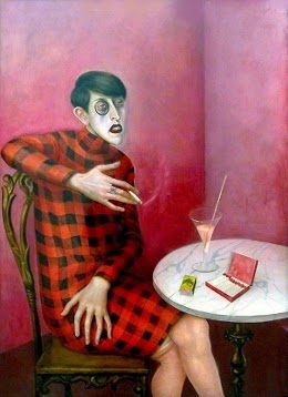
After speaking to Sharon and Kat Vogart about my design, I decided to go a slightly different route and create the Otto Dix painting on both sides of the face, but just the top half. I softened the white as I got further down the face to create a "ombre" to mimic the "ombre" of the pink and yellow under the eye, and this helped to make the lips stand out a little more and look even more contemporary.

 There were a few issues with the makeup, for example the black around the eyes kept on creasing no matter what I did; powder, eye shadow base etc. I definitely will not be using greasepaint on the eyes again! I had to stand behind the camera with my blending brush in hand and fix it after every couple of shots and it all turned out fine. I had to do the same with lips, due to the sheer amount of gloss and lipstick used to achieve the effect, I had to continuously fix it as we went along . It was really great experience as I got a photography student to shoot for me. and we worked really well together, continuously checking the photos as they were being taken to see what adjustments needed to be made and what was showing up on camera etc. 

I'm extremely happy with how my look turned out, despite the makeup issues. I definitely feel that I  overcame them quite well however.


I also had to deepen the brush line on the nose that was part of my design. Up close it looked fine, but on camera it just looked well contoured, but it needed to be a little more defined to look like a brush stroke.


New Berliners


Sunday 30 November 2014

Contemporary Character development

Otto Dix:
Grotesque
Harshly realistic
Subjective
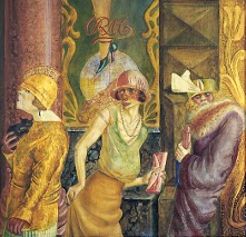
The Salon I, Otto Dix 1925

Paco Peregrin 

Colour
Bold


For my contemporary Sally, I was inspired by the studio lesson we had where we recreated Otto Dix's portrait of Sylvia von Harden on each others faces. Whilst researching Otto Dix I came across his painting titled "The Salon", above. The woman in the middle of the three women immediately makes me think of Sally Bowles. Her headpiece screams cabaret performer, and there is something about her expression compared to the other two women. She is looking out at something or someone, and has an intrigued, almost inquisitive expression on her face, where the other two women on either side of her appear disinterested and almost appear to have lost hope.

I then began researching Paco Peregrin, who was suggested to me as a reference, and came across the above picture.The colours of the eye makeup bore a striking resemblance to the Otto Dix portrait and I loved the way they had been contemporised.

I decided to try and use elements of each picture towards my final design. I experimented with recreating Dix's picture on one half of the face and blending it into a contemporary version on the other side of my face. The focus on the eyes and the exaggerated eyelashes is my reference to Sally, whilst the colours and the application of the cheek colour on the contemporary side references my club kid design.

Below is my face chart for this design and some experimentation I did.


Dadaism

Dadaism
a revolt by certain 20th-century painters and writers in France, Germany, and Switzerland against smugness in traditional art and Western society; their works, illustrating absurdity through paintings of purposeless machines and collages of discarded materials, expressed their cynicism about conventional ideas of form and their rejection of traditional concepts of beauty.  Dadaist, n. (1)

Dada was an early twentieth century art movement starting in Europe, that became international, spreading as far as Russia and Tokyo.  It emerged after the first world war, with many of its artists war veterans who had experienced the brutality of war. As such, Dada became a very anti-war centred movement. From this stemmed an anti-bourgeois and anti-nationalist sentiment as these were the people responsible for the war in their eyes. The artists were very jaded and disillusioned, and the war represented the falling of many social structures that led to the violence. They believed corruption was rife amongst the middle classes and so the Dada movement started out as a rebellion, not only against war, but against the conventional norms of society, especially what was conventionally classed as "art".  It became known as the anti-art movement and poet Tristan Tzara was quoted saying "The beginnings of Dada were not the beginnings of art, but of disgust." (2)


The International Dada Fair in 1920, held in Berlin. The central figure of this was a puppet of a german soldier with a pigs head, hanging from the ceiling. http://www.moma.org/learn/moma_learning/themes/dada 26/11/14


Der Blutige Ernst, George Grosz http://www.dadart.com/dadaism/dada/022-dada-berlin.html 29/11/12


Cut with the Kitchen Knife, Hannah Höch http://www.dadart.com/dadaism/dada/022-dada-berlin.html 29/11/12

Saturday 29 November 2014

Otto Dix


Otto Dix (Born Wilhelm Heinrich Otto Dix) was a German painter, who became well known for his harshly realistic, satirical portrayals of Weimar Berlin. He was a huge part of the German Expressionist movement and along with George Grosz, he is considered one of the most influential artists of the Neue Sachlichkeit (New Objectivity). 


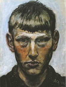
Self Portrait, Otto Dix 1912 


Born in Untermhaus, Germany in 1891, Dix was heavily influenced by art from an early age. He spent long hours in the studio of his cousin, Fritz Amann. He then spent 4 years doing an apprenticeship with painter Carl Senff, before entering the Academy of Applied Arts in Dresden. 


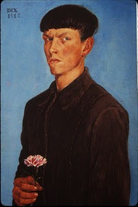
Self Portrait with Carnation, Otto Dix 1913


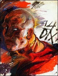
When the First World War began, Dix readily volunteered his services, and was heavily influenced by the sights of war. He spoke of a recurring nightmare after the war, where he was crawling through destroyed houses. The two paintings below, are Self Portraits he did in the first year of the war. They were done on the same piece of paper. The first side, he has depicted himself in combat, with explosions and bright lights all around him, with his eyes wide open. The second side depicts him in full uniform and in darkness; a stark contrast to the prior painting. 


Self Portrait as a Soldier, Otto Dix 1914

Self Portrait as a Soldier with a Gunners Helmet, Otto Dix 1914
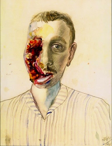
The next painting is from 1922, titled "Wounded War Veteran". You can see how his painting style has changed drastically after the war, as he starts to paint in his now signature style of emphasising flaws in his subjects.

Wounded War Veteran, Otto Dix 1922
After the War, Dix returned home, before moving to Dresden, where he studied at the Dresden Academy of Fine Arts. He became a founder of the Dresden Secession group (a short lived collaboration of German Expressionists) in 1919. He met George Grosz in 1920 and began participating in Dada (an early twentieth century international art movement that protested against war and the bourgeois) exhibitions and movements. He also participated in the German Expressionist exhibition that year.

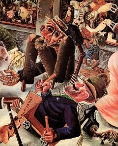
He joined the Berlin Secession in 1924. He was developing an increasingly realistic style of painting that used thin glazes of oil paint over a tempera underpainting. His 1923 painting "The Trench", depicting dismembered and decomposed bodies of soldiers after a battle, caused such agitation and commotion that the Wallraf-Richartz Museum where it was displayed, hid it behind a curtain and the museum curator was forced to resign a few years later.

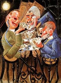
Dix's work, like that of Grosz, his friend and fellow veteran, was extremely critical of contemporary German society. It drew attention to the bleaker side of life, and spared no detail on prostitution, violence, desperation, old age and death. 

Prager Strasse, Otto Dix 1920

Skat Players, Otto Dix 1920

The Salon I, Otto Dix 1921

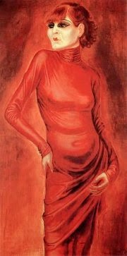
The Dancer Anita Berber, Otto Dix 1925

Three Prostitutes on the Street, Otto Dix 1925

Portrait of the Journalist Sylvia Von Harden, Otto Dix 1926


http://www.ottodix.org/index/catalog-paintings Viewed 28/11/14